
LinkedIn is moving with the times. The new interface has been heavily modernised and given a cleaner look that will now make it easier to find new contacts, interact with connections, and write posts.
The main changes are to the home page, the profile section (which is now entitled ‘Me’), search options, my network, and notifications.

Home Page
You’ll immediately notice the difference of the home page on desktop, with the deep teal menu bar, which is also thinner, and the icons matching those on the LinkedIn mobile app. On the left of the screen, a snapshot of your profile appears with your picture, professional headline, the number of people who have viewed your profile, and views of recent articles.
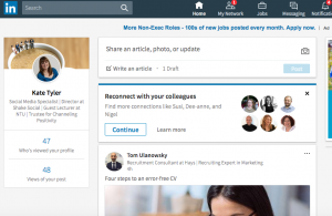
There’s a slight difference in the content sharing section, which is in the centre of the home page. You have the option on your home page to share an article, photo, or update, meaning it is now easier to share content or publish an article right from your LinkedIn profile.
‘Me’
In the LinkedIn mobile app, what used to be the Profile section is now called ‘Me’. Notice that your background photo has changed size in the new design, with the recommended being 1536 x 768 pixels. Your profile photo is also circular and appears front and center in the intro section.
Your contact info shows up on the right-hand side when someone views your profile, while under the Me section, you can see who’s viewed your profile and articles. Beneath that, you’ll see recommendations to strengthen your profile.
This used to appear at the top of your profile but now it’s in a less obtrusive position. There’s also a new section called Accomplishments, where you can add projects, courses, publications, certifications, honours, awards, and patents.
Search
The biggest change on LinkedIn is in search. The new user interface doesn’t have the advanced search options, so you can no longer filter searches by keyword, first and last name, title, and location.
However, you can still filter by the level of connections, general locations, companies, industries, profile language, non-profit, language, and schools. From the search page you can also seek out jobs, companies, groups, and schools.
Two other features, saved searches and tagging, are no longer available for free. However, LinkedIn’s premium option, Sales Solutions’ Sales Navigator, allows for saved and advanced searches, and tagging.
My Network
This section allows you to see your invitations and people you may know, as well as click into those profiles. However, when you click onto your connections, the only options now are to message them or remove them. LinkedIn has also removed all other sorting features and tags so you can only sort by recently added, first name, and last name.
Notifications
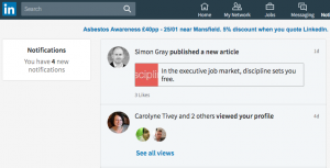
Notifications get their own section in the new LinkedIn user interface, which makes it much easier to view interactions and respond. This enables you to view work anniversaries, people in your network who published an article or have been mentioned in the news, birthdays, and promotions. You’ll also see people who have followed you, endorsed you, and engaged with your articles and other content.
More
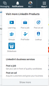
Interests has reverted back to More, and it’s the same icon as in the mobile app. You can access LinkedIn Learning, Post a Job, Groups, ProFinder, Lookup, and SlideShare, as well as upgrade to Talent Solutions or Sales Solutions. Previously, you needed to search to find them.
LinkedIn wants users to have a more cohesive experience between the mobile app and the desktop browser, which is what this update accomplishes.
Although a lot has changed, the Messaging, Jobs, and Ads features have remained much the same in the new user interface. Some features, such as certain search functions and tagging, may be missing from the free version of LinkedIn. However, most marketers will find the new user interface more intuitive.
Looking for some support with your LinkedIn profile? Get in touch.